
Welcome to Part 3 of our series!
Part 1: An Introduction to BigQuery Graph for unstructured data
Part 2: Tutorial: Build a BigQuery Graph from unstructured data
Part 3 (this post): Query and Visualize your BigQuery Graph
In Part 2, we built a BigQuery Graph from unstructured data. Now, it’s time to query and visualize it.
Graph Query Syntax 101
Graph Query Language (GQL) in BigQuery allows us to match patterns across our data. It uses a syntax similar to Cypher, where nodes are in () and edges are in []. It’s meant to feel intuitive because you’re “drawing” the connection with code.
- Nodes (): Parentheses represent entities. (p:Product) means “find a node with label Product and assign it to alias p”.
- Edges []: Brackets represent relationships. [e:PURCHASED] means “an edge with label PURCHASED assigned to alias e”.
- Direction ->: Arrows show the direction of the relationship. (a)-[e]->(b) means an edge goes from a to b.
- Filters {}: Braces allow you to filter properties inline. For example:(p:Product {id: ‘123’}).
💡 You can create a new notebook in BigQuery to visualize your BigQuery Graph — or you can follow along in this notebook.
Query 1: Inspecting the graph
Before we jump into visualizations, let’s start with a standard query to extract specific data from our Graph as a table.
By using the node labels we assigned earlier, you can easily filter the graph at the source.
In this case, we’ll filter for only the Product and Part nodes, ignoring the rest of the data to focus strictly on how products and parts connect.
GRAPH `my_dataset.manufacturing_kg`
MATCH (p:Product)-[e:CONTAINS_PART]->(pt:Part)
RETURN p.product_name, pt.part_name
How does the filtering work?
- Label Constraints: Adding :Product and :Part to our parentheses acts as a filter, ensuring the query engine only considers nodes with these specific tags.
- Edge Type Filtering: Specifying [:CONTAINS_PART] ensures we aren’t accidentally traversing other relationship types, like materials or sales, keeping the focus strictly on what components make up a product.
- Directional Focus: The arrow -> enforces the logical hierarchy, ensuring the query follows the path starting at the Product and traversing down to the parts.
Visualizing the Graph
Now that we know how to query the data, let’s visualize it. In BigQuery Notebooks, you can use the %%bigquery — graph magic command to visualize your query results.
💡 Pro Tip: Appending a variable like display_only will suppress the messy JSON text so you can focus on the visualization.
Query 2: The Birds-eye view
This query matches every node connected to any other node. It’s the best way to spot clusters, outliers, or “lonely” data points.
To use the graph visualization, you must return the nodes and edges using the TO_JSON() function.
%%bigquery --graph display_only

GRAPH `my_dataset.manufacturing_kg`
MATCH (source)-[r]->(target)
RETURN
 TO_JSON(source) AS Source_Node,
 TO_JSON(r) AS Edge,
 TO_JSON(target) AS Target_Node
In the interactive view, you can drag and select nodes to explore connections.
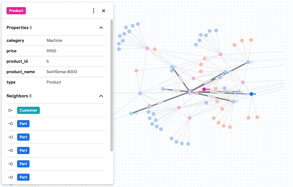
Clicking on any individual node reveals a detailed side panel, allowing you to inspect its specific properties and neighboring relationships.
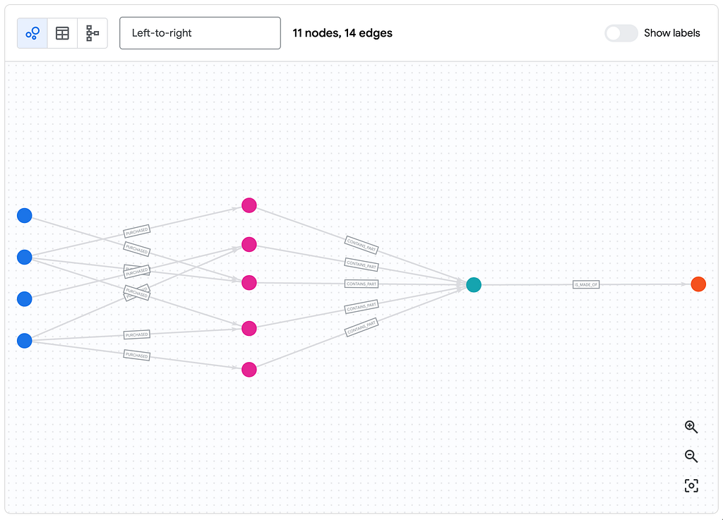
Query 3: Visualizing parts of the graph
Now let’s take the exact same logic we used in our first query, but this time we’ll visualize it in our notebook.
We need to swap our RETURN statement to output the full JSON of the nodes and edges, and add our magic command at the top.
%%bigquery --graph display_only

GRAPH `my_dataset.manufacturing_kg`
MATCH  (p:Product)-[e]->(pt:Part)-[c]->(m:Material)
RETURN
  TO_JSON(p) AS product,
  TO_JSON(e) AS contains_part,
  TO_JSON(pt) AS part,
  TO_JSON(c) AS made_of,
  TO_JSON(m) AS material

This is our manufacturing hierarchy, we can see we have Product nodes branching out into its specific Part nodes, which then further connect to their underlying Material nodes
Query 4: Multi-Hop Risk Analysis
Let’s say a supplier has warned us that “Fiberglass” batches are defective. Which customers are affected? To answer this, we need to traverse: Customer Purchases > Product -> Part -> Material.
In standard SQL, this would involve multiple JOINs, which can be slow, costly and unreadable. In GQL, the match statement remains a single, readable line:
%%bigquery --graph display_only


GRAPH `my_dataset.manufacturing_kg`
MATCH  (c:Customer)-[r]->(p:Product)-[e]->(pt:Part)-[f]->(m:Material {material_name:"Fiberglass"})
RETURN
TO_JSON(c) AS customer,
TO_JSON(r) AS purchased,
TO_JSON(p) AS product,
TO_JSON(e) AS contains_part,
TO_JSON(pt) AS part,
TO_JSON(f) AS made_of,
TO_JSON(m) AS material
You can change the layout style of your graph to give a better view of your relationships. Here we can clearly trace a single defective material on the right back to all of the affected customers on the left!
⚠️ A note on querying with AI Agents
LLMs are great at generating NL2SQL (Natural Language to SQL) code. They’re not as hot on GQL simply because it’s a newer standard and LLMs haven’t been trained on nearly as much “graph code” as they have on traditional relational queries. It’s definitely worth providing your agent with a few-shot examples in the system instructions to prevent hallucinations.
Conclusion
We’ve journeyed from unstructured PDF manuals to a fully queryable Knowledge Graph:
- Parsed complex PDF layouts into clean data using Document AI.
- Transformed that text into nodes and edges using Gemini’s reasoning.
- Visualized and queried those connections natively using BigQuery Property Graphs and GQL.
This architecture enables you to ask complex questions of your unstructured data that were previously impossible or incredibly manual. You no longer have to choose between unstructured document storage and structured relational analytics — they can finally live, and be queried, side-by-side.
Ready to try it yourself? Here are your next steps:
- 🔓 Get Access: BigQuery Graph is currently in private preview. Sign up to test it out in your Google Cloud project.
- 🏃 Run the code: Check out this notebook to run this end-to-end pipeline on your own data.
BigQuery Graph Series | Part 3: Query and Visualize your Graph was originally published in Google Cloud – Community on Medium, where people are continuing the conversation by highlighting and responding to this story.
Source Credit: https://medium.com/google-cloud/bigquery-graph-series-2e35bb203aac?source=rss—-e52cf94d98af—4


 in Cisco Catalyst SD-WAN Manager")


